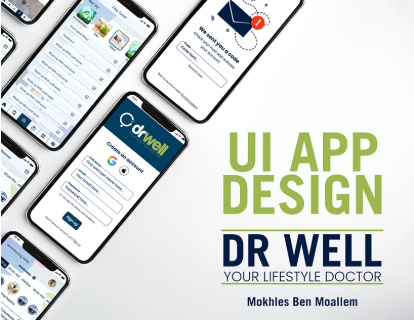
The challenge
The client had a working MVP developed by a local dev team but no professional design layer. The app functioned but had a 40% drop-off on the onboarding flow — users were signing up, hitting the first 3 screens, and abandoning. The navigation was confusing and the visual hierarchy gave no indication of what the primary actions were.
The brief: redesign the app interface with a focus on reducing cognitive load during onboarding, improving clarity of the main dashboard, and creating a design system the dev team could implement and maintain without needing a designer on every change.
Our process
- User flow audit: mapped every screen of the existing app, identified the 6 friction points that caused the onboarding drop-off.
- Wireframes: low-fidelity wireframes for the 12 most critical screens, validated with the dev team before any visual work.
- Design system: built a token-based design system in Figma: 4 semantic color categories, 2-font typographic scale, spacing system (4px base unit), and 18 reusable components.
- High-fidelity screens: 42 screens covering all states (default, loading, error, empty, success) for every user-facing flow.
- Interactive prototype: Figma prototype covering the 3 primary user journeys — shareable link provided to the client for stakeholder review and dev reference.
- Developer handoff: annotated specs, exported assets in correct resolutions, and a 2-hour handoff call walking through every component.
Key design decisions
- Onboarding: reduced from 6 steps to 3, moving data collection to post-activation. Drop-off addressed at the architecture level, not just visually.
- Dashboard hierarchy: primary action made 3× larger than secondary actions. Users shouldn't have to think about what to tap.
- Color system: dark base with high-contrast accents — optimized for outdoor readability on Tunisian mobile usage patterns (often bright sunlight).
The result
Development team implemented the design over 6 weeks. Post-launch onboarding drop-off reduced from 40% to 14% in the first month. The design system enabled the team to add 8 new screens in the following quarter without external design input.