The challenge
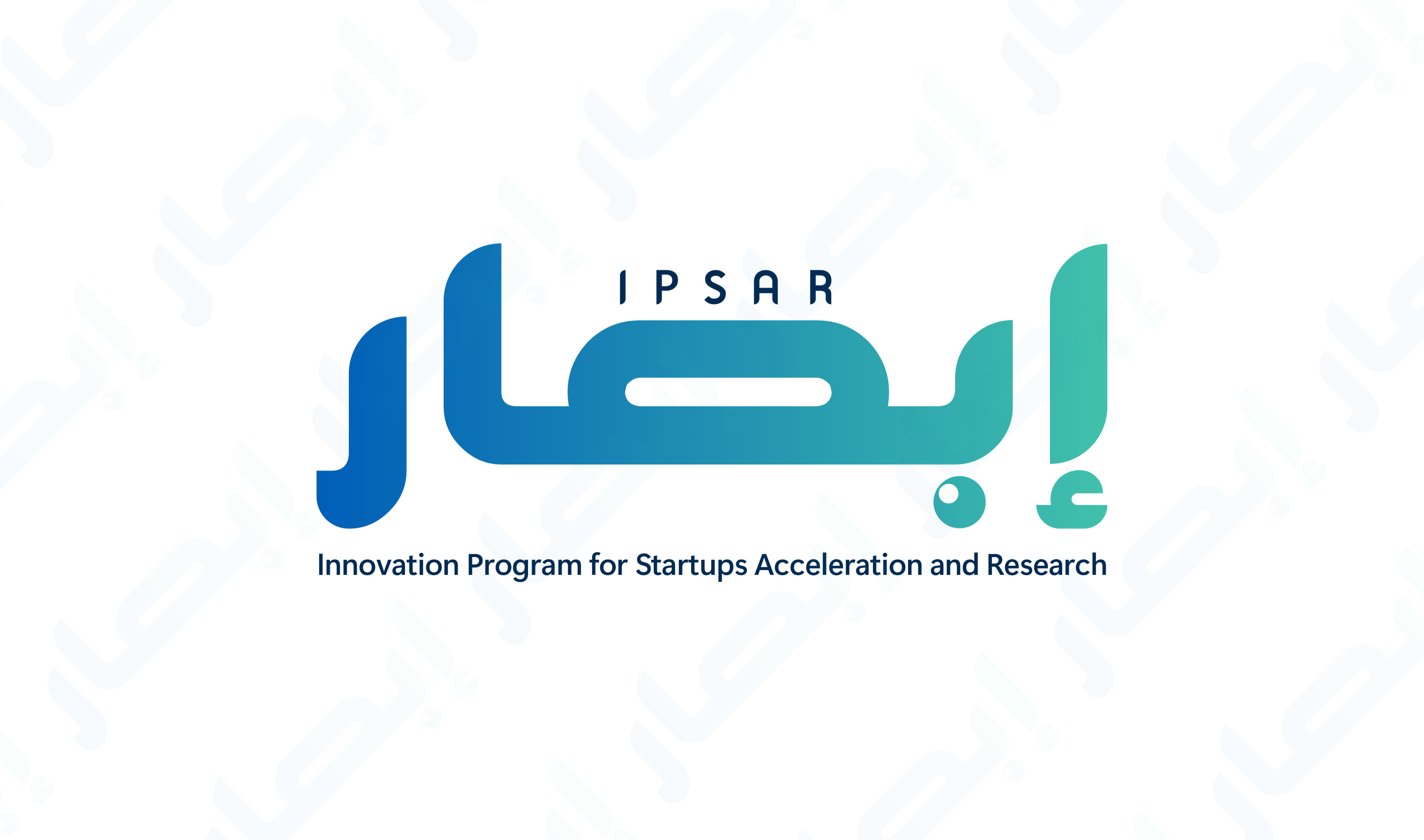
IPSAR needed a logo that communicated professionalism and trust in a market where generic, clip-art-level logos are the norm. The brief called for something geometric, modern, and scalable — a mark that would hold its integrity at 16px as a favicon and at 3 meters on a banner.
What we did
We explored three distinct directions: a monogram approach using the I and P letterforms; a geometric symbol that abstractly referenced the brand's sector; and a wordmark with custom typographic treatment. After rapid client review, the geometric symbol direction was selected for refinement.
The final mark uses a balanced geometric form with precise proportional relationships — a design that reads clearly across all media. The primary black and white version is accompanied by a full suite of color variants and usage guidelines.
Deliverables
- Primary logo (light and dark versions)
- Horizontal and stacked variants
- Monochrome versions
- Favicon and app icon
- Usage guidelines (2-page document)
- All source files (AI, EPS, SVG, PNG)
Result
A distinctive, modern identity mark that gives IPSAR a professional visual presence consistent with international design standards. The geometry-first approach ensures the logo works at any size and in any context.